What a project page needs before a buyer will call
One page per home turns a gallery into proof. Here's what each project page should include, in the order buyers actually read it.
So most builder websites I look at have a gallery, twelve homes or maybe twenty, all on one page as a grid of photos. It looks like a lot of work, and it is, but it only shows that you've built homes, not how you build them.
For a buyer comparing two or three builders, that difference is usually the one that decides it.
The short version: give every home its own page, and tell the story of that build. Here's what each page needs, in the order buyers read it:
The facts, at a glance
The hard part, and how you solved it
Photos of the build, not just the result
The people who built it
One clear next step
Why one page per home matters
Before the how, here's why a single page beats a gallery.
Buyers rarely decide alone. They find a home they like and want to send it to their spouse, their agent or their architect. With a gallery, the best they can do is send the whole grid and say "the third one down, I think." With a project page, they send that home.
Project pages also let a buyer compare. They can hold one of your smaller homes in one tab and one of your largest in another and see the difference for themselves.
And each page is another way to be found. A buyer searching for builders in a specific neighborhood can land right on the home you built there. On Patriot Homes, every home gets its own page and its own photography for exactly that reason, and it's how I build every custom home builder website.
Start with the facts
The top of the page is for scanning, so keep it to the basics:
The neighborhood or town
The size, plus bedrooms and baths if you like
The lot, if it was unusual
How long the build took
The year it was finished
Buyers are looking for a home that looks like their own plans, and these facts are how they recognize it. A family with a sloped lot in the same school district will stop on a page that says so, before they look closely at a single photo.
Lead with the hard part
This is the part most builders leave out, and it's the most persuasive thing on the page.
Every build has a problem worth telling. A lot that fell away steeply from the street, an old tree you designed the garage around, a family that needed to be in by a certain date, or a planning board that took four months to say yes.
They feel like complications, so builders hide them. But a buyer's real fear isn't that the finished home will be ugly, it's that something will go wrong in the middle and nobody will handle it. A few sentences about what was hard and how you solved it answers that fear directly, with a real example.
Three or four sentences is plenty: what the problem was, what you decided and how it turned out.
Show the build, not just the result
Finished photos prove the result, and photos from during the build prove the process.
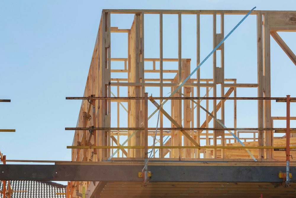
Buyers who have never built a home can't picture the middle, and the middle is where their worry lives. Aim for six to ten images per home, in build order:
The site before you started
Foundation and framing
A few progress shots from the inside
The finished exterior
The finished interior, room by room
If you haven't been taking progress photos, start on your next build. A phone is fine for those, because nobody expects magazine quality from a framing photo, and the honesty of it is part of the point.
Name the people
Custom home buyers are hiring people, not a logo, so show them who they'd be working with.
If the same framing crew has been with you for years, say so. If you worked with a particular architect or designer, name them and link to them. If you're on site every week, say that too.
This matters most if being hands-on is part of how you work. A buyer who has been burned before wants to know they'll be talking to the builder, not just a project manager.
What to leave out
A project page isn't a brochure, and a few things usually make it weaker:
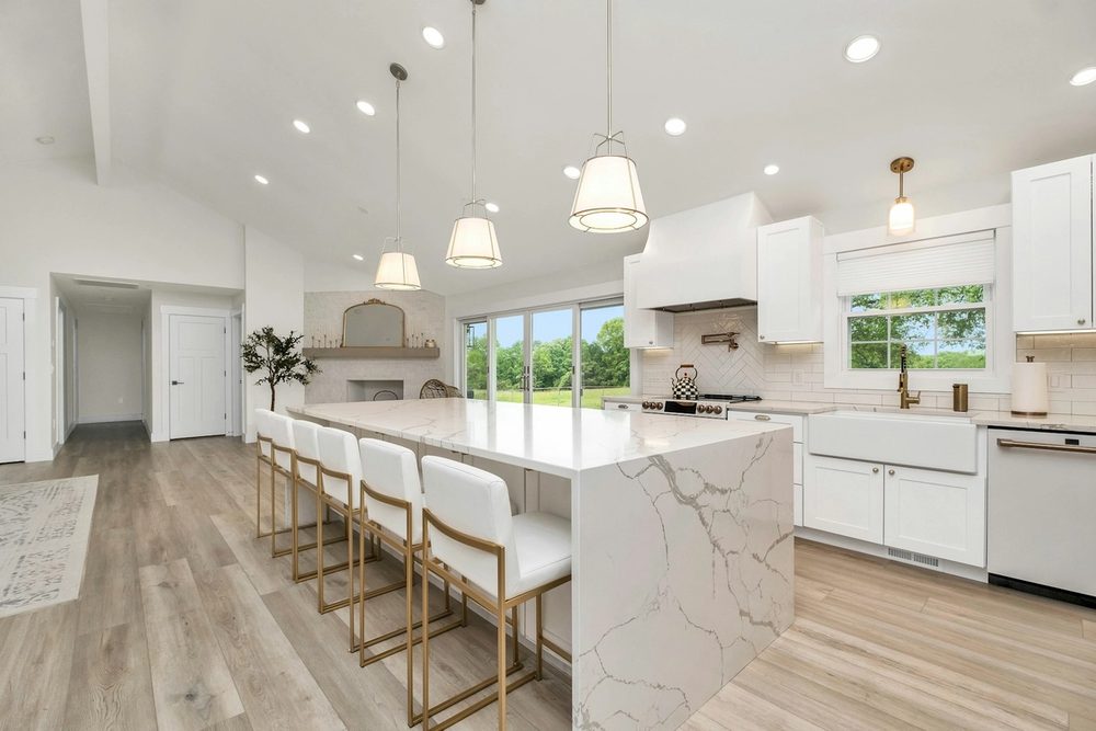
Generic descriptions. "Stunning open-concept living with luxurious finishes" could describe any home at any price, so write what's actually specific about this one.
Every photo you have. Forty shots of the same kitchen bury the ones that matter. Pick the best six to ten.
Long lists of materials and brands. Most buyers skim past them. If a choice mattered, mention it in the story instead.
Anything you couldn't say to the homeowner's face. Write it as if they'll read it, because they might.
When in doubt, cut. A shorter page with one good story and the right photos does more than a long one that tries to say everything.
Close with one clear next step
At the bottom of each project page, give the buyer one obvious thing to do.
Usually that's a short line like "Planning something similar? Let's talk," with a link to your contact page or your phone number. Keep it the same on every project page so a buyer always knows where to go.
Next steps
You don't need twelve project pages to start. Here's how I'd get going:
Pick the three homes that best represent the work you want more of: one at the bottom of your price range, one at the top and one with an unusual problem.
Write those three pages first, using the order above.
Add a new page every time you finish a home, within a month of the final photos.
Within a year, your website will be doing what your best referrals do now, showing a buyer exactly what it's like to build with you before they ever pick up the phone. For the rest of the site, here's what a custom home builder's website needs to win the job.
If you'd like a second set of eyes on your project pages, reach out here and I'll tell you honestly what I'd change.