What a custom home builder's website needs to win the job
Most builder websites look fine and still lose good buyers. Here is what the site actually has to do, page by page, to turn a referral into a first call.
So when I was in real estate, I noticed something I still think about every time I open a builder's website. The same house, shown two different ways, became two different prices in a buyer's head, even though nothing about the building changed.
Your website does the same thing to your homes. Most builder sites I look at aren't bad, they load, they list a phone number and they show some photos, but they still lose good buyers quietly, and nobody ever calls to tell you why.
The short version: your website has one job, which is answering the questions a buyer has after someone recommends you, before they decide whether to call. Here's what that takes:
One finished home first on your homepage
A page for every home you build
A plain page on how a build works
Some sense of price
An inquiry form that feels like a conversation
All of it working on a phone
Start with the buyer you actually get
Before you change a single page, it helps to picture who's actually looking.
Most of your best buyers come by referral. An agent, a past client or an architect mentions your name, and that night they look you up on their phone, often with a spouse looking over their shoulder.
They're not browsing, they're checking. In those few minutes they want to know three things:
Do you build homes like the one we want, at roughly our budget, where we want to live?
What is it actually like to build with you?
How do we take the next step?
Every page on your site should help answer one of those questions. Anything that doesn't is decoration at best and a distraction at worst.
The homepage: one finished home first
This part is about the first five seconds, which is all the time your homepage really gets.
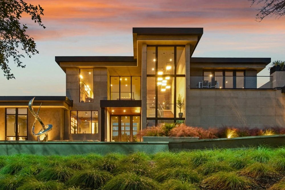
The first screen has one job, which is showing a buyer that you build homes like the one they want. The fastest way to do that is to open on one real finished home, photographed well, with a single line under it giving the neighborhood, the size and what made the build hard.
A slideshow of everything at once or a slogan both fail that test the same way, because they make the buyer work to find the answer. After the first screen, the homepage only needs to earn the next click: a few more homes, a short outline of how a build works and one clear way to get in touch.
Project pages: one page per home
If you only build one new kind of page this year, I'd make it this one.
A gallery shows that you've built homes, but a project page shows how you build them. Give each home its own page with the facts at the top, a few sentences about the hard part and how you solved it, six to ten photos in build order and the names of the people involved.
Project pages are what a buyer forwards to their spouse and compares side by side, and they're what turns up when someone searches for a builder in a particular neighborhood. On Patriot Homes, a custom builder in Victoria, BC, every home gets its own page and its own photography for exactly that reason. I go deeper on this in what a project page needs before a buyer will call.
A process page that answers the first call
Here's a cost most builders never notice, which is answering the same handful of questions on every first call.
Almost every first conversation with a custom home buyer covers the same ground. How long does it take? What happens first? How often will we talk? What happens when something goes wrong?
Put the answers on your site. A simple page that walks through the stages, from the first meeting to handing over the keys, calms a buyer who has never built before, and it means your first call starts further along. Keep it plain:
The stages, in order
Roughly how long each one takes
What the buyer needs to do at each one
Some sense of price
This is the part builders push back on most, so I'll keep it short.
Most builders leave pricing off on purpose, and I understand why, because every home is different. But buyers who can't tell whether they're in range usually don't ask. They assume you're out of reach, or they assume the opposite, and either way the first call starts in the wrong place.
You don't need a price list. One honest line like "most of our homes fall between ___ and ___" is usually enough to bring in the buyers you want and gently turn away the ones you don't.
An inquiry form that feels like a conversation
The contact page is where a lot of good leads quietly disappear, and it's usually an easy fix.
A single box labeled "Message" with a Submit button gives a buyer no idea what to say, what happens next or when they'll hear back. A better form is short and specific:
Ask for a few useful things: their name, how to reach them, where the lot is and their rough timing.
Tell them exactly what happens after they send it, and when they'll hear from you.
Put your phone number right next to the form for the buyers who'd rather call.
Send an automatic reply that confirms you got it, written in your own words.
Built for the phone first
Most buyers open your site from a link someone texted them, so the phone version is the real version.

That means photos that fill the width of the screen, text you can read without zooming, a phone number you can tap and a menu that doesn't hide the important pages.
Here's the simplest test I know. Open your own site on your phone and try to answer the three buyer questions from the top of this post, and if any of them takes more than a couple of taps, that's the first thing to fix.
Everything around the website
Your website is only one stop, and buyers check the others too.
Before calling, most buyers also look at your Google profile, read your reviews and compare you with the other builders on their list. If those stops tell a different story from your site, the referral can fall apart before it ever reaches you. I walk through each stop in where custom home buyers look before they call you.
Next steps
You don't have to fix everything at once. If I were starting on your site this week, this is the order I'd go in:
Swap the first photo on your homepage for one real finished home, with one line of facts under it.
Put your phone number somewhere visible on every page.
Write project pages for the three homes that best represent the work you want more of.
Add a simple process page.
Clean up your Google profile and ask two recent clients for a review.
None of these need a new website. Together, they change what a buyer finds in those first few minutes, which is where the job is won or lost.
If you'd like a second set of eyes on your site, that's what my website audit for custom home builders is for, and I'll tell you honestly what I'd fix first. And if you already know you need a new one, here's how I design websites for custom home builders.